Task - implement custom grid display in PHPRunner or ASPRunner.NET applications on mobile screens. The idea is to use the same HTML and achieve our goal using CSS only.
CSS Grid layout is nothing new and excellent tutorials are available on the web for those who want to learn more. In this article we will only cover all the relevant details to PHPRunner and ASPRunner.NET.
In this article, we will be using our Forum template as an example of using CSS Grid Layout.
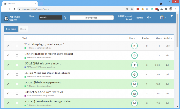
Desktop version
Here is where we start. Just a regular desktop grid with all database fields occupying their own cell.
Mobile version
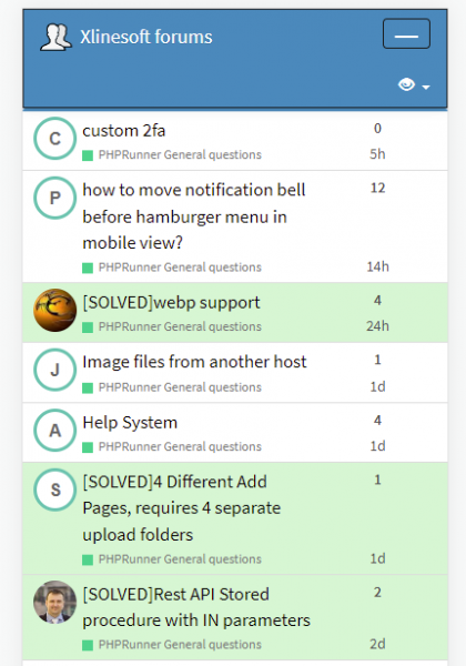
This is what we aiming for. We want to have two rows and three columns. First column is occupied by StartedBy field, second column holds Topic and Category fields, and the last column displays Replies and Activity fields.
Here is a more schematic look of the desired layout. Note the numbers in red, these are grid coordinates that we will use in our CSS to define where each field is to be displayed.
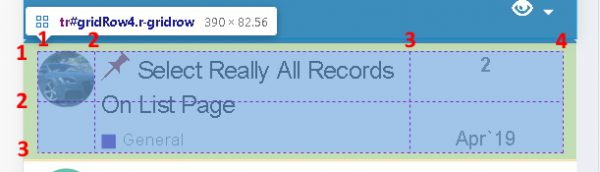
Now take a look at the top left cell. It's occupied with the userpic of the user, who started the thread. We want this image to occupy both cells of the first columns. If you take a look at the numbers in red, you see that we want to take the space between markers 1 and 2 horizontally, and between markers 1 and 3 vertically. So here is the CSS that does the job for this column:
.r-gridrow td[data-field="startedby"] {
   	 grid-column-start: 1;
    	 grid-column-end: 2;
         grid-row-start: 1;
         grid-row-end: 3;
  }
And here is the complete CSS for this kind of layout. It needs to be added to Editor -> Custom CSS screen.
// the following code will only apply to the mobile version, when display width us 767 pixels or less
@media screen and (min-width: 767px) {
    // lets set gridrow properties
   .r-gridrow {
        display: grid !important;
        grid-template-columns: 40px 60% auto;
	/* we want the first column to take 40 pixels, the second column should take 60% and the third column will occupy the rest */
	/* here we remove unnecessary margins and borders */
        margin-bottom: 0px !important;
        border-radius: 0 !important;
        border-top: 0px !important;
        border-left: 0px !important;
        border-right: 0px !important;
        border-bottom: 1px solid #DDDDDD;
    }
    // startedby field - first column and we let it occupy both rows
   .r-gridrow td[data-field="startedby"] {
   	 grid-column-start: 1;
    	 grid-column-end: 2;
         grid-row-start: 1;
         grid-row-end: 3;
  }
  // fields topic and category are combined in one and we let them occupy both rows of the second column
  .r-gridrow td[data-field="topic"] {
    grid-column-start: 2;
    grid-column-end: 3;
    grid-row-start: 1;
    grid-row-end: 3;
    //нужен отступ слева от startedby
    padding-left: 5px !important;
   }
   // forumreplies field - third column, first row
   .r-gridrow td[data-field="forumreplies"] {
    grid-column-start: 3;
    grid-column-end: 4;
    grid-row-start: 1;
    grid-row-end: 2;
    padding-right: 5px !important;
    padding-left: 5px !important;
    font-weight: bold;
    text-align: center !important;
   }
   // activity field - third column, second row
   .r-gridrow td[data-field="activity"] {
    grid-column-start: 3;
    grid-column-end: 4;
    grid-row-start: 2;
    grid-row-end: 3;
    text-align: center !important;
    align-self: end;
   }
}
This is pretty much it and you can use this technique in your own projects to customize the look of the mobile version.
Additional info
If you want to learn more about CSS frid layout, check these links:
https://www.codeinwp.com/blog/css-grid-tutorial-layout/
https://www.freecodecamp.org/news/a-beginners-guide-to-css-grid-3889612c4b35/